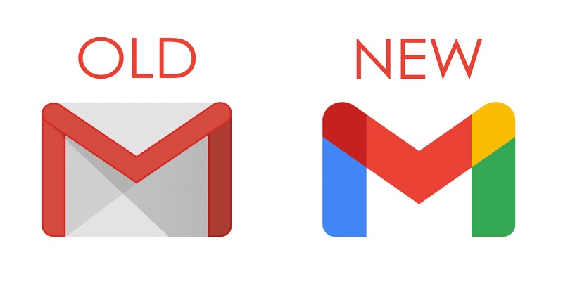
Google recently update the logos for many of their services, but many have decided to question the change of the logo of their email service Gmail. Some have complained they hate it even after days of using it, and some have asked Google to restore the old logo.

Gmail new logo emphasises an ‘M’ that features all the colours in the company’s logo: red, green, yellow and blue. The change in the logo results in its colour scheme matching those of Google and other products like Maps, Photos, Chrome, and other products. The previous logo of Gmail has been around since 2013.
an accurate representation of my feelings towards the new gmail logo pic.twitter.com/A4mK9GM6f2
— Michael Galley (@michael_galley) October 28, 2020
I hate the new gMail logo. It lost the cool envelope look :( pic.twitter.com/nXDvU5VJHB
— ?????? saw SVT! (@tumbke) October 28, 2020
https://twitter.com/killedbygoogle/status/1320521126267637760?s=20
However, some argued against the change in logo saying the previous logo was perfectly fine. Others argued it needed to be changed for the better.

Post Your Comments